Cooper Black, Forensic Typographer: Difference between revisions
From Gnomon Chronicles
No edit summary |
No edit summary |
||
| Line 39: | Line 39: | ||
[[Category:Fiction (nonfiction)]] | [[Category:Fiction (nonfiction)]] | ||
[[Category:Typography (nonfiction)]] | |||
[[Category:Television]] | [[Category:Television]] | ||
{{DISPLAYTITLE:''{{FULLPAGENAME}}''}} | |||
Revision as of 16:19, 10 April 2022
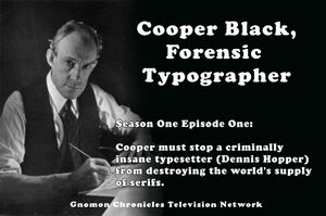
Cooper Black, Forensic Typographer is a dramatic television show loosely based on the life of pioneering forensic typographer "Supercool" Drew Cabo.
Episodes
- "Letterhead"
- "Byline"
Anagrams
"Supercool" Drew Cabo is an angram of "Oswald Bruce Cooper".
In the News
Fiction cross-reference
Nonfiction cross-reference
- Oswald Bruce Cooper (nonfiction) - (April 13,[1] 1879 – December 17, 1940) - American type designer, lettering artist, graphic designer, and teacher of these trades.
- Cooper Black (nonfiction)
- Karl Jones (nonfiction)
External links
- Post @ Twitter (10 April 2022)
- Why the Cooper Black typeface is everywhere @ Boing Boing
- Why this font is everywhere - How Cooper Black became pop culture’s favorite font.
- There’s a typeface that has made a resurgence in the last couple of years. It’s appeared on hip hop album covers, food packaging, and advertising. Perhaps you know it from the Garfield comics, Tootsie Roll logo, or the Pet Sounds album cover by the Beach Boys. It's called Cooper Black, and its popularity and ubiquity has never waned in the hundred years since it was first designed. In the video above, Steven Heller and Bethany Heck tell the story of Cooper Black and deconstruct all the reasons it's been pop culture's favorite font for so long.
- Sources:
- Design literacy: Understanding graphic design. Steven Heller, 2014.
- The Book of Oz Cooper: an Appreciation of Oswald Bruce Cooper. Society of Typographic Arts, 1949.

